By Maralee Sautter
STC’s Summit 2021 is in the rearview mirror now, gone but not forgotten. Since there was an array of wonderful session choices, my article is based on my personal viewpoint, and totally opinionated. The good news is that I won’t throw any rotten tomatoes (even though there were a few presentations that deserved a toss).
Kudos to STC and Engagez
While we wanted to meet in person, this year’s Summit was all virtual. Therefore, my first mention goes to STC for using the Engagez platform. While there were some audio difficulties the first day, the overall platform was very accessible and intuitive.
The main menus were simple, and I easily learned about speakers and how to download their presentation slides. Navigation was easy during and after the Summit conference. By going to the Sessions tab, I was able to find all presentations with ease. Isn’t that what we look for in good web design?
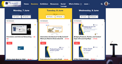
The following graphic is an example of the Engagez platform open in the Sessions tab
.
Favorite Impactful Message
Design for Cognitive Bias: Using Mental Shortcuts for Good Instead of Evil
Presenter David Dylan Thomas created an impactful message for me, because Cognitive Bias is new territory. He changed my understanding of bias and how it applies to techcomm. His presentation was packed with many examples of how bias works and how we can frame information in a less-biased way. Thomas provided real-world examples to identify some harmful biases that frequently lead users to make bad decisions.
Some of the presentation terms and takeaways are outlined below:
- Cognitive Bias. A series of shortcuts (patterns) that our mind takes to get us through the day. We have trillions of decisions to make, daily. Allowing our minds to go on Auto-Pilot allows us to avoid spending energy making decisions on most of them.
- Confirmation Bias. When you have an idea stuck in your head, you only seek supporting evidence and ignore any opposing evidence—perhaps calling it fake news.
- Cognitive Design. When we find it harder to read a message, it becomes less believable. When it’s easier to read a message, it becomes more believable. Good design makes messages memorable when it uses:
- plain language
- pictograms (infographics)
- clear messages
- rhyming
For example: A seat belt campaign in Texas, Click it or Ticket, used rhyming to clearly communicate that tickets would be given to people not wearing their seat belts.
- Assumption Audit. A checklist for information design includes identities that might not be in the room—the under-represented—but that will be impacted by the design. By honoring and understanding the identities, the design becomes more inclusive.
- Deformation Professionnelle. How a person sees the world through the lens of their job. By changing the bias, the job is defined with more humanity towards one another.
- Design Ethics and Design Justice Network. Groups pushing to include real user-centered design versus shareholder design (directed by corporations) by humanizing those identities that are under-represented and excluded, despite being impacted by a design.
Thomas ended by asking, “How can we define our jobs to be more human to one another?”
Favorite Infographics Presentation
No Money, No Design Skills, No Problem
Presenter Mike Parkinson is an infographic genius, and his presentations are always well-attended. In this session, he provided great ideas about creating infographics on a budget using free and inexpensive assets.
Parkinson contended that we live in an at-a-glance society. The most efficient way to communicate content and visualization is also the most challenging. To create complex graphics that tell a story, known as infographics, Parkinson asserts that you need to buy or build graphic assets.
There are two families of graphics:
- The vector graphic (made mathematically), recognized as svg, emf, wmf, ai, and eps file types
- The raster graphic (made of pixels), recognized as png, jpg, tif, and gif file types
There are three styles of design:
- Traditional (Skeuomorphic) – dimensional, realistic, glitzy; appeals to >40 year-olds
- Flat – simple with no aesthetic embellishment; appeals to people <40 year-olds
- Material – blended traditional and flat design; the best choice for the widest appeal
The following graphic is a visual example of design styles.
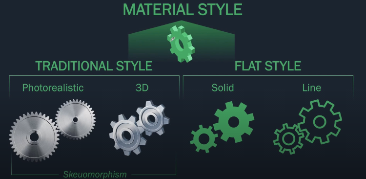
(Image courtesy of Mike Parkinson, www.billiondollargraphics.com)
An audience reacts to a graphic, first aesthetically, and then intellectually. Material Design is the best approach for the average audience, because it’s not too glitzy, it’s not too cartoonish, it’s just right.
Parkinson contends that before building a graphic, the first phase is to design by:
- knowing your audience
- creating a clear message (motivator and means)
- providing an explanation or validation of the point
Using key concepts, Parkinson demonstrated how to build a graphic for Eagle Solutions and 3 CleverKeys, an anti-fraud software company.
The second phase is to design by:
- chunking information
- assembling the pieces
- visualizing the graphic
In the remainder of the presentation, he gave examples of the best types of graphics for visualizing concepts, and a demo of building graphics in PowerPoint with and without the Build-a-Graphic add-on. As usual, Parkinson successfully engaged his audience with great slides, smooth performance skills, and amazing demos and content. There’s always so much to learn, and I am grateful to have the slides to review and play with PowerPoint on my own.
Favorite Fun Event
Summit 2021 IDL SIG Social Event
At Summit, the were many fun virtual events:
- a magician billed as the Magician at Virtual Deception
- a trivia game
- a blues guitarist
- the STC talent show
However, the most fun I experienced was at the IDL SIG Social Event: Each of us is YOU-nique!
Attendees went on a scavenger hunt in their homes, and bringing back items they found, shared “finds” in the Zoom screen with us. People shared their stories of why the item was special to them, and we learned how each story was unique, but still part of the human fabric that binds us. Behind the scenes, SIG volunteers were surreptitiously spotlighting, learning about, and screen-grabbing photos of the attendees. After the event, a special scrapbook page was assembled and sent to each attendee who participated.
Note: There were many more presentations and events at Summit that were fantastic, and a personal favorite of mine: Tell Your Story the Disney Way, was presented by Lou Prosperi. Read Jamye Sagan’s article about Summit 2021 to see her reviews, including Lou Prosperi’s presentation.